Tabloid- A tabloid is a newspaper with pages that are more compact and smaller than those of a broadsheet, although there are no specific measurements of the tabloid format. Tabloid Journalism tends to emphasise more everyday topics such as sensational crimes, TV and celebrity gossip. This is not always appropriate as ‘The Independent', a broadsheet, is in tabloid format. Generally this layout is used by local newspapers in the United Kingdom
 Broadsheet- a broadsheet is the largest of the various newspaper formats and is characterized by long vertical pages covering all in all more serious news.
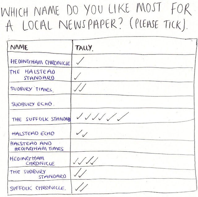
 Local- a local newspaper adopts a similar layout to that of a tabloid, it is compact and smaller than a broadsheet. A local newspaper concentrates on news in one particular region, for example one particular county or on a smaller scal one particular town e.g. The Braintree and Witham Times. These newspapers document events and news in their local area and seem to remain politically neutral with the local community

